Installation and usage instructions are available on GitHub.
All images in the examples are given width="100%" property to make them responsive.
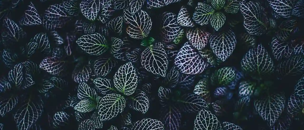
Default settings
Make handle larger and disappear on focus
At the CSS level, the component supports default pseudo selectors, such as :focus and :hover. This can be exploited when setting the component's behavior.
Shadows
Some shadows can be used to give the separators and arrows more contrast on a light background.
Warning: shadows have a negative effect on the rendering performance of the component.
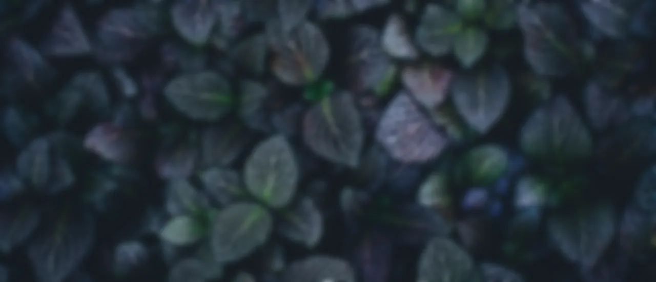
Divider and handle color
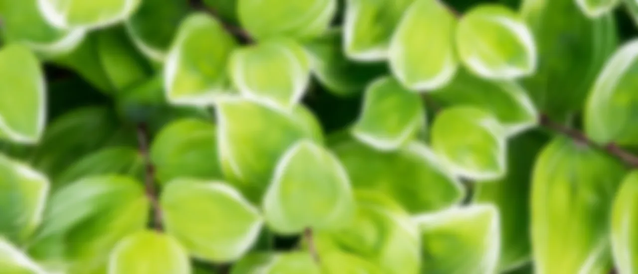
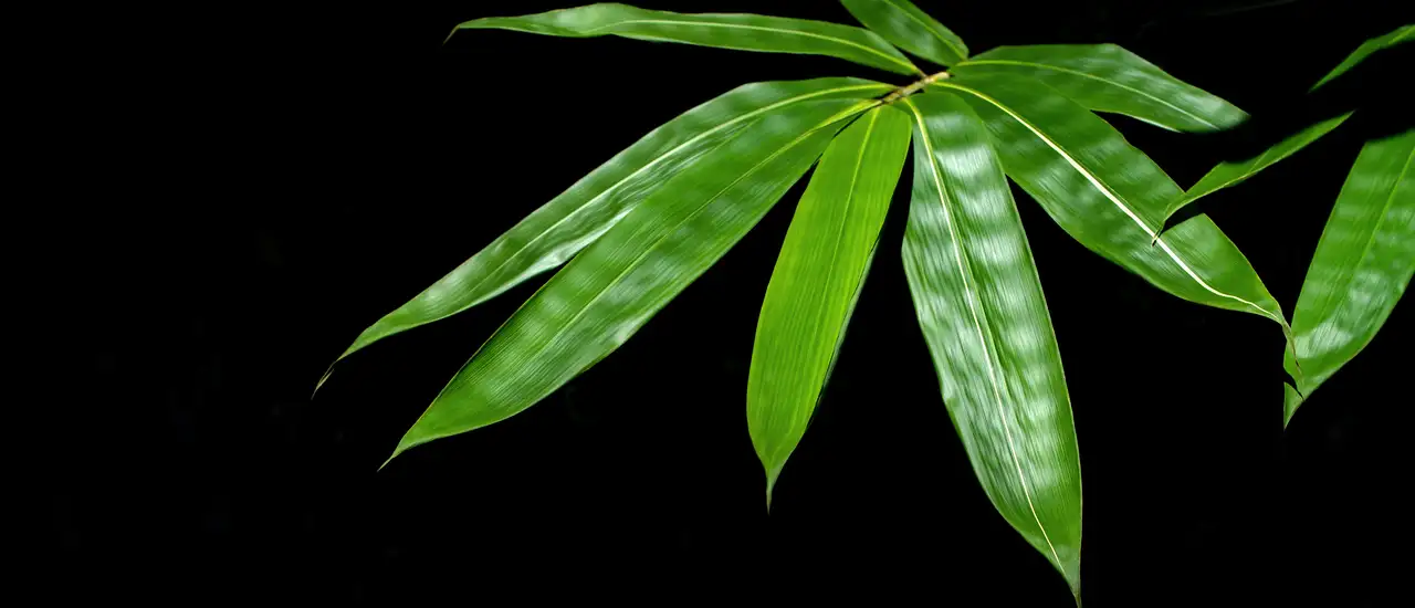
Relative size handle
Resize the window to see it in action.
Change element :focus styles
Custom handle
Add the slot="handle" attribute to any tag within <img-comparison-slider> and it becomes a handle. In this example, we will use <svg>.
Custom handle with hover animation
The combination of the component's :hover and :focus pseudo-classes, CSS, and arbitrary HTML for a handle provides many options for styling the component.
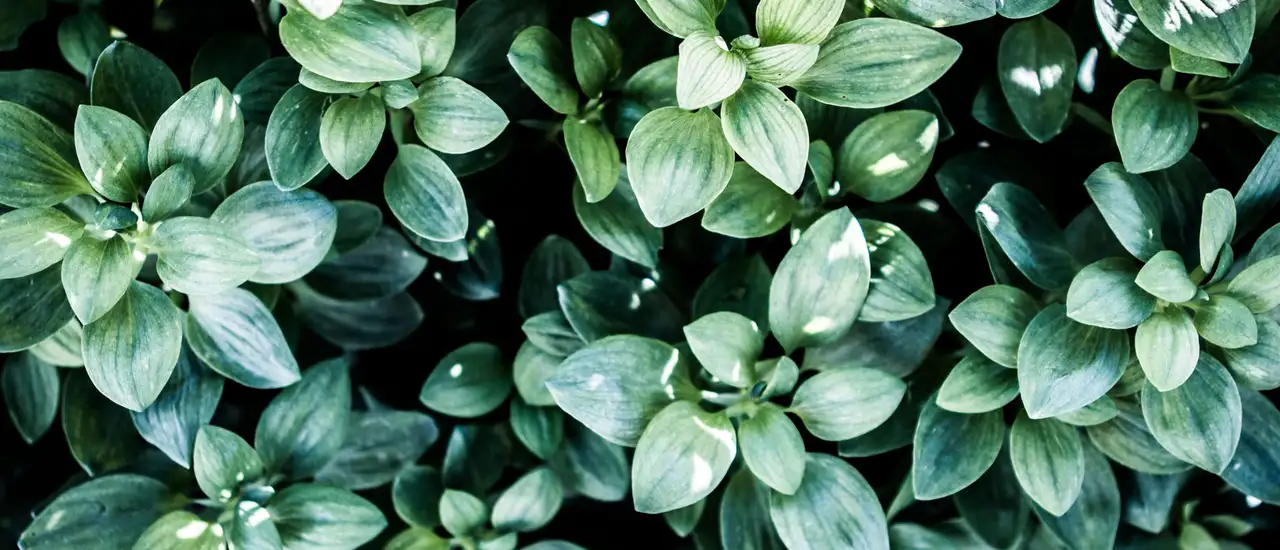
Without handle and with split line width
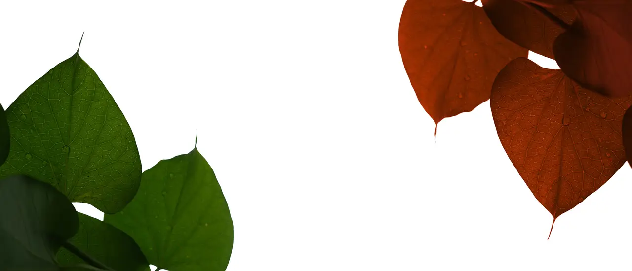
Before and after labels
The first and second do not necessarily have to be an <img> tag. They could be any HTML tag. Let us use this to our advantage and create good-looking, semantic-friendly labels.
BeforeAfter
Divider position
The divider position can be specified as a percentage using the value property.
Automatic slide on mouse over
Automatic slide on mouse over can be set up with hover property.
Vertical slider
The slide direction can be set with the direction property.
Shameless Ad: if you are learning a foreign language, you might like my other project, Vocably.